Hhere is a graph that shows the percentage of mortgages that have negative ranked by state. The number in the bubble states are truly staggering.
![[NegativeEquityQ42009.jpg]](https://4.bp.blogspot.com/_pMscxxELHEg/S4RTiPORa-I/AAAAAAAAHlE/5a3IHzUKBF0/s1600/NegativeEquityQ42009.jpg)
And this next graph gives an idea of what percentage are deeply underwater (i.e., > 25% under water) in the bubble states.
![[NegativeEquityFig22009.jpg]](https://1.bp.blogspot.com/_pMscxxELHEg/S4RUoYX9vMI/AAAAAAAAHlM/HjZUQgNIMGM/s1600/NegativeEquityFig22009.jpg)
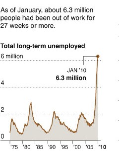
With unemployment likely to stay elevated for a long time, these states are going to continue to have housing problems for 3 to 5 years. Other states will probably see there prices stabilize over the next two years or so. The following shows the current long term unemployed problem. The US population grew by 33% since 1982, so the ’82 peak of around 3 million is equivalent to around 4 million today. We are now over 6 million of long term unemployed.
The following graph shows the growing inventory of rentals the building boom created. This will keep rents from rising any time soon. Because rent accounts for 30% of CPI, this will also act as a dampener on CPI numbers as energy and food prices rise when the economy picks up. For retired home owners this means that it will feel like the CPI is under representing their cost increases because they will be noticing the energy and food price changes.
![[RentalUnits2009.jpg]](https://3.bp.blogspot.com/_pMscxxELHEg/S4QQhiZmzVI/AAAAAAAAHkk/ug7ls42c-bQ/s1600/RentalUnits2009.jpg)

Housing – Negative Equity
Hhere is a graph that shows the percentage of mortgages that have negative ranked by state. The number in the bubble states are truly staggering.
And this next graph gives an idea of what percentage are deeply underwater (i.e., > 25% under water) in the bubble states.
With unemployment likely to stay elevated for a long time, these states are going to continue to have housing problems for 3 to 5 years. Other states will probably see there prices stabilize over the next two years or so. The following shows the current long term unemployed problem. The US population grew by 33% since 1982, so the ’82 peak of around 3 million is equivalent to around 4 million today. We are now over 6 million of long term unemployed.
The following graph shows the growing inventory of rentals the building boom created. This will keep rents from rising any time soon. Because rent accounts for 30% of CPI, this will also act as a dampener on CPI numbers as energy and food prices rise when the economy picks up. For retired home owners this means that it will feel like the CPI is under representing their cost increases because they will be noticing the energy and food price changes.
This entry was posted by David on February 28, 2010 at 8:54 am, and is filed under Commentary. Follow any responses to this post through RSS 2.0.You can leave a response or trackback from your own site.