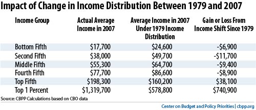
Here are how incomes have changes over the last 30 years.

In percentage terms we get the following.
- Bottom Fifth: 28% decline
- Second Fifth: 25% decline
- Middle Fifth: 15% decline
- Fourth Fifth: 10% decline
- Top Fifth: 24% increase
- Top 1%: 128% increase
If we break the top 1% into smaller groups we see an even more pronounced trend.
| Percentile |
99-99.5 |
99.5-99.9 |
99.9-99.99 |
99.99-100 |
| Income Increase |
81.10% |
120.50% |
220.70% |
402.80% |
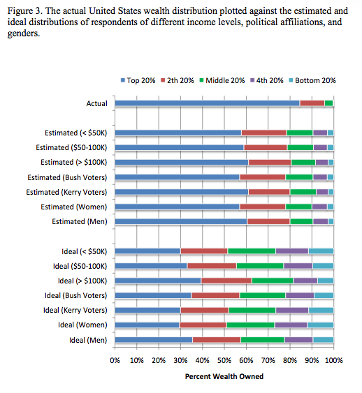
In the following graph I recommend ignoring the ideal bars because I think the questions they used were flawed, but I find it very interesting that people’s perception about wealth distribution were consistently (no matter your demographic group) more evenly distributed than reality by a large margin. To me this says that if the reality starts to gain traction in people’s beliefs this could have huge political implications. My only guess as to why people’s beliefs are so off is that most people want to believe in a more even distribution and since most people don’t intermingle with a lot of people in very different socioeconomic circles from themselves, they tend to overestimate the evenness of the distribution.

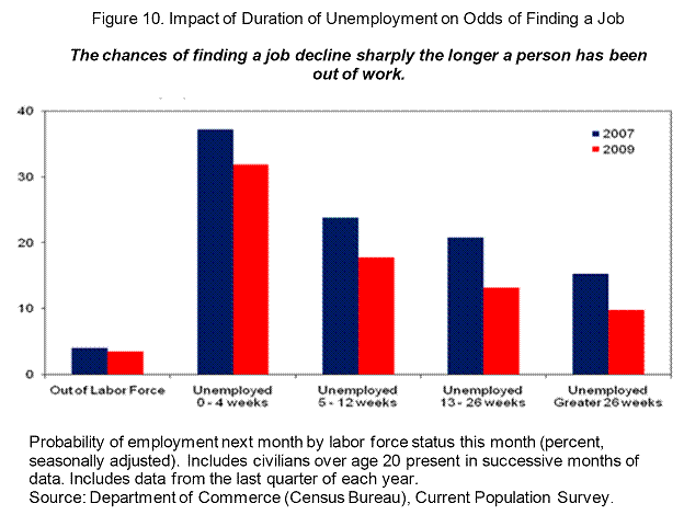
The last graph is how long term unemployment affects one’s job prospects. As you would expect, the longer you stay unemployed the harder it is to find a job. With the record number of people facing long term unemployment they are not going to be going away anytime soon, even if the economy starts to pick up more.

Sources
Changes to Income Distribution
Here are how incomes have changes over the last 30 years.
In percentage terms we get the following.
If we break the top 1% into smaller groups we see an even more pronounced trend.
In the following graph I recommend ignoring the ideal bars because I think the questions they used were flawed, but I find it very interesting that people’s perception about wealth distribution were consistently (no matter your demographic group) more evenly distributed than reality by a large margin. To me this says that if the reality starts to gain traction in people’s beliefs this could have huge political implications. My only guess as to why people’s beliefs are so off is that most people want to believe in a more even distribution and since most people don’t intermingle with a lot of people in very different socioeconomic circles from themselves, they tend to overestimate the evenness of the distribution.
The last graph is how long term unemployment affects one’s job prospects. As you would expect, the longer you stay unemployed the harder it is to find a job. With the record number of people facing long term unemployment they are not going to be going away anytime soon, even if the economy starts to pick up more.
Sources
This entry was posted by David on October 12, 2010 at 5:52 pm, and is filed under Commentary. Follow any responses to this post through RSS 2.0.You can leave a response or trackback from your own site.