 A month has passed since my last jobs posting, so I thought an update would be useful. For those who like to jump to the punchline: the hemorrhaging of jobs has ceased, but significant job growth isn’t going to appear this year. This means housing prices will stay under pressure and inflation and interest rates will stay low for the rest of the year. And I still see the long term unemployed becoming an increasingly important political factor over the next few years. Now on to the graphs!
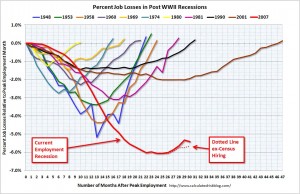
This graph on the right is one of my favorites for tracking the progress of the unemployed. As you can see if you factor out the temporary census jobs, we have barely started to climb out of the unemployment hole that has been dug.

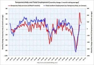
The graph on the left uses “temporary help services” as a leading indicator (by 4 months) for employment. The red line is the three month average change in temporary help services (left axis). This is shifted four months into the future. The blue line (right axis) is the three month average change in total employment (excluding temporary help services). This suggests there will be no dramatic increase in hiring through the end of the year.

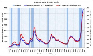
And lastly, let me return to the plight of those who have been unemployed for a long time. As you can see, this aspect of this recession was very different from any other post war recession. Because long term unemployed start to lose skills and will likely have to find a new employer (as opposed to going back to work for one that temporarily laid them off), getting these folks hired again is slower process. Looking at the little bit of history in this graph we can see that we have never been able to reduce this unemployment rate by more than 0.5% a year. So to get us from 4.5% long term unemployed down to a more normal 1%, will likely take at least 7 years!
Anemic Job Outlook
This graph on the right is one of my favorites for tracking the progress of the unemployed. As you can see if you factor out the temporary census jobs, we have barely started to climb out of the unemployment hole that has been dug.
The graph on the left uses “temporary help services” as a leading indicator (by 4 months) for employment. The red line is the three month average change in temporary help services (left axis). This is shifted four months into the future. The blue line (right axis) is the three month average change in total employment (excluding temporary help services). This suggests there will be no dramatic increase in hiring through the end of the year.
And lastly, let me return to the plight of those who have been unemployed for a long time. As you can see, this aspect of this recession was very different from any other post war recession. Because long term unemployed start to lose skills and will likely have to find a new employer (as opposed to going back to work for one that temporarily laid them off), getting these folks hired again is slower process. Looking at the little bit of history in this graph we can see that we have never been able to reduce this unemployment rate by more than 0.5% a year. So to get us from 4.5% long term unemployed down to a more normal 1%, will likely take at least 7 years!
This entry was posted by David on July 8, 2010 at 12:16 pm, and is filed under Commentary. Follow any responses to this post through RSS 2.0.You can leave a response or trackback from your own site.