This is the first of a series of posts that are going to look at current market valuations.
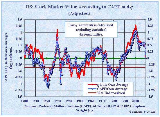
The following is a graph of two valuation measures: Cyclically adjusted price earnings (CAPE) and q. It was put together by Smithers & Co. and goes from 1900 throuh October 9th, 2008. CAPE is based on Shiller’s work where he averages 10 years of inflation adjusted earnings to smooth out earnings over the business cycle to calculate the PE ratio. q is the ratio between the value of companies according to the stock market and their net worth measured at replacement cost.
This graph is a little unusual in that 0 marks the average of the series and its on a log scale so that a doubling of the average displays with as much up as halving the average displays down.

As at 9th October, 2008, with the S&P 500 at 909.9, the US stock market was almost exactly at fair value according to CAPE and 7% over-priced according to q. Since then the market has hit lows 15% lower and is currently around this value again.
This should give you a good feel for how stratospheric valuations were, considering that after the huge fall equities just went through they are only around their average valuation historically. While I think the market has priced in the credit crisis and a significant recession, if the recession should prove to be worse than expected, there is still plenty of room for valuations to fall a lot further.
So how much downside risk is their currently? My expectation is that prices could easily drop 30% from todays values. For valuations to drop further, I believe it will take more time and will more likely come in the form of unrewarded earnings growth (i.e., companies will earn more but their prices wont keep pace, similar to the 70’s).
Market Valuations – q and CAPE (PE10)
This is the first of a series of posts that are going to look at current market valuations.
The following is a graph of two valuation measures: Cyclically adjusted price earnings (CAPE) and q. It was put together by Smithers & Co. and goes from 1900 throuh October 9th, 2008. CAPE is based on Shiller’s work where he averages 10 years of inflation adjusted earnings to smooth out earnings over the business cycle to calculate the PE ratio. q is the ratio between the value of companies according to the stock market and their net worth measured at replacement cost.
This graph is a little unusual in that 0 marks the average of the series and its on a log scale so that a doubling of the average displays with as much up as halving the average displays down.
As at 9th October, 2008, with the S&P 500 at 909.9, the US stock market was almost exactly at fair value according to CAPE and 7% over-priced according to q. Since then the market has hit lows 15% lower and is currently around this value again.
This should give you a good feel for how stratospheric valuations were, considering that after the huge fall equities just went through they are only around their average valuation historically. While I think the market has priced in the credit crisis and a significant recession, if the recession should prove to be worse than expected, there is still plenty of room for valuations to fall a lot further.
So how much downside risk is their currently? My expectation is that prices could easily drop 30% from todays values. For valuations to drop further, I believe it will take more time and will more likely come in the form of unrewarded earnings growth (i.e., companies will earn more but their prices wont keep pace, similar to the 70’s).
This entry was posted by David on December 12, 2008 at 9:03 am, and is filed under Commentary. Follow any responses to this post through RSS 2.0.You can leave a response or trackback from your own site.